The Commercial Design Details That Help Customers Move, Browse and Buy
Key Takeaways
- Retail interior design shapes more than atmosphere: it determines how far customers travel into a space and what they engage with along the way.
- The entry zone, circulation path, and product placement work together. Getting one wrong affects all three.
- Shop design that extends dwell time tends to increase purchase likelihood, since customers who browse longer encounter more products and feel more invested.
- Lighting, sightlines, and signage are directional tools, not just aesthetic ones.
- Customer journey design starts at the door and accounts for every decision a shopper makes before reaching the counter.
Introduction
There is a particular kind of retail store that bleeds customers. Not because the products are wrong. Not because the prices are off. Just because the layout gives nobody a reason to stay. You walk in, glance around from the entrance, feel like you have clocked the whole place, and leave. The whole visit might be ninety seconds.
Slow months get blamed on foot traffic, on competitors, on the economy. But sometimes the floor plan is just not giving people a reason to keep going, and that is harder to fix than any of those other things.
What Retail Interior Design Actually Controls
Retail interior design covers the physical decisions that determine where customers go, what they see, how long they stay, and whether they buy. The floor plan, where fixtures sit, how wide the aisles are, how light falls: each shapes behaviour, and together they determine whether a visit turns into a sale.
Where businesses go wrong is treating shop design as a styling question when it is really a spatial one. The finishes matter, but they sit on top of the floor plan. If the floor plan is not working, nothing else compensates.
“The floor plan is the sales strategy. Everything else is how you dress it.”
The Entry Zone
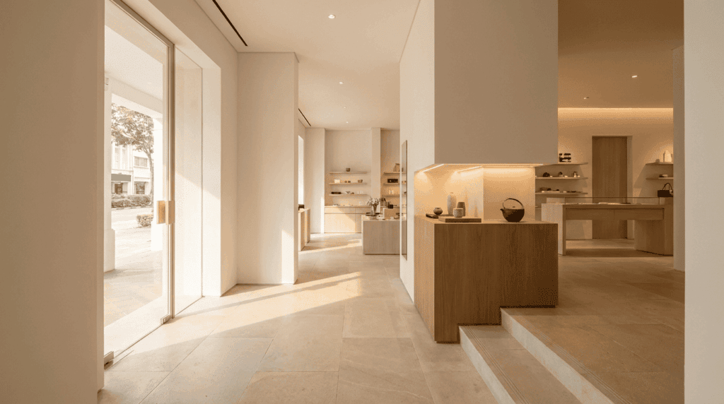
The first two or three metres inside any retail door gets more research attention and less practical consideration than almost anywhere else in the store. Most retailers fill that space immediately with a display, some signage, the product they most want to move. It feels logical. First thing customers see, first opportunity to sell.
But customers walking through the door are not shopping yet. They are still adjusting to the scale of the room, the light level, the temperature. A product right at the threshold competes for attention at exactly the moment someone is deciding whether they even want to be there. It mostly gets ignored.
Research has found that 90% of shoppers instinctively turn right upon entering a store, which makes the right-hand side genuinely valuable, but only once someone is a few steps in and actually present. Good retail interior design treats that entry stretch as an orientation moment, not a selling moment. A short open space. A clear sightline into the floor. One display that signals what kind of store this is. That is usually enough.
Circulation: The Four Layout Patterns
Most retail floors follow one of four circulation patterns: grid, free-flow, loop, or racetrack.
Grid layouts run aisles in parallel. They suit places where customers already know what they want: supermarkets, pharmacies, hardware stores. They miss customers who are open to browsing, because you only really see what is directly in front of you as you move through.
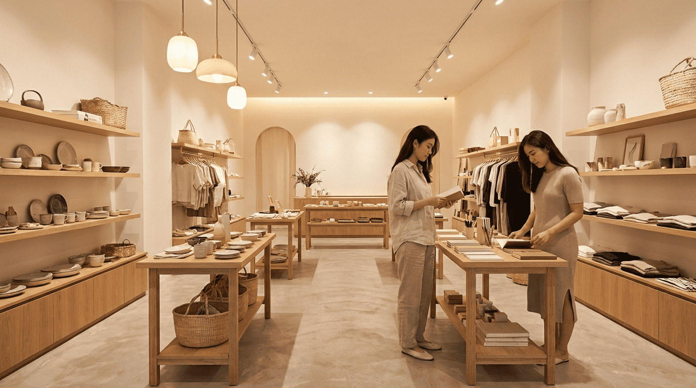
Free-flow layouts leave the path open and let fixture placement guide movement. Boutiques and lifestyle stores favour this because finding things unexpectedly is part of the appeal. The downside is that without strong visual anchors, customers can feel unsure where to go and leave sooner than they might have.
Loop and racetrack layouts guide shoppers along a defined route through the whole floor before they reach the exit. Longer dwell time correlates directly with higher purchase likelihood. The more of a store someone sees, the more likely they are to buy something, even something they had no intention of buying when they walked in.
For compact Singapore retail floors, a modified free-flow with a loose internal loop usually works best. It gives customers the sense of discovering things without requiring wide dedicated aisles that smaller spaces cannot afford.
Lighting as a Directional Tool
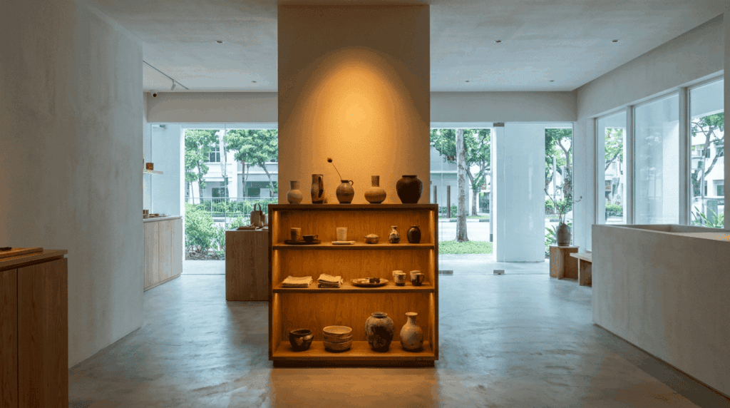
Retail lighting typically gets approached the same way residential lighting does: enough brightness to see clearly, a fitting that suits the look of the space. Functional, but it ignores most of what lighting actually does in a retail environment.
Accent, task, and ambient lighting each send different signals inside a store. Spot a single product with accent light against slightly dimmer surroundings, and it pulls attention from across the room in a way a sign on the shelf cannot. Warm light in a browsing area slows people down and makes them more comfortable stopping. Cooler light near checkout speeds decisions along. A bright back wall draws customers further into the space before they start deciding what to engage with.
None of this requires an expensive installation. It requires a lighting brief that treats each zone of the store differently, decided before the fit-out drawings are finalised.
Product Placement and the Logic of Discovery

Put the right two products next to each other, and a customer who came in for one walks out with both. Cross-merchandising works because a lot of people come to physical stores specifically for the experience of finding things they were not looking for, something online shopping does not replicate well.
Height matters more than most businesses give it credit for. Anything below knee level barely gets glanced at. Anything above eye level might as well not be there. The band between hip and eye height is where most purchasing decisions actually happen, so a fixture plan that spreads product evenly across all shelves wastes the top and bottom on space where almost no engagement occurs.
Signage: Where It Goes Wrong and Where It Should Start
In a lot of retail spaces, signage accumulates rather than gets planned. A confusing layout leads to a sign. Another pain point leads to another sign. Over time, the space fills up with directions, labels, and notices that were each solving a specific problem but together make the store feel cluttered and hard to read.
The fix is not better signs. It is a floor plan that does not create the confusion in the first place. When customer journey design is built into the brief, the need for corrective signage drops significantly because the layout itself guides people. Wayfinding signs still have a role: at corners and zone transitions where customers have to choose a direction, a clear marker keeps them moving forward. Promotional signage works well in dwell zones, where customers have already slowed down and are open to considering something. The same sign in a busy walkway just gets walked past.
“Good signage answers the question before the customer has to ask it. Bad signage exists because the layout did not.”
What Cactus Art Considers First
When Cactus Art works on a retail or F&B fit-out, the floor plan comes before the material selections. Entry zone placement, the circulation route, where focal displays sit, where the transaction point lands relative to the browsing floor: these get settled in the brief. That is what separates shop design that converts from a space that simply looks good at handover.
Commercial design trends in Singapore have been moving toward experience-led retail for years. But experience depends on the floor plan working. A wabi-sabi retail space feels calm partly because of the materials and partly because the layout gives customers room to move at their own pace. The two things are harder to separate than most briefs treat them.
Frequently Asked Questions
1. What does retail interior design actually affect?
Where customers go, how long they stay, and whether they buy. The floor plan determines which products someone gets close enough to consider. Lighting shapes what catches the eye. Signage affects how confidently people move through the space. The same foot traffic in a well-designed layout versus a poorly designed one produces different sales results.
2. Which shop design layout works best for smaller Singapore retail spaces?
A modified free-flow with a loose internal loop suits compact floor plates better than a grid. Customers get the feeling of browsing and discovering rather than following a prescribed path, while the loop keeps them moving past more of the product range before they decide they are finished. The entry still needs a short open stretch before the layout starts directing anyone.
3. How does lighting change what customers do in a store?
Accent lighting on a single product draws attention across a room faster than any nearby signage. Warm light in a browsing zone slows people down and raises dwell time in that area. A bright back wall encourages customers to travel further into the space before they start deciding where to stop. These are directional effects that work without the customer being aware of them.
4. What should signage do in a well-planned retail space?
Answer the questions customers have as they move through the store. At decision points where the path is unclear, a marker keeps someone moving forward rather than backtracking. In dwell zones, signage can surface a product detail or offer to someone already inclined to browse. Customer journey design means planning where those moments fall during the brief, not placing signs reactively once the store is open.
5. Why does a store lose customers quickly even with healthy foot traffic?
Usually the layout. If the entry zone gives no reason to go further in, customers form an impression from the door and leave. If the circulation path feels unclear, people lose confidence and retreat. If there are no moments of discovery, no sense that something worth finding might be a bit further along, the visit ends early. These are all spatial problems with spatial solutions.
Conclusion
The decisions that shape whether people move through a space, stop, and buy are layout decisions made in the brief, well before a finish material is chosen. Cactus Art’s commercial interior design work covers retail interior design, F&B, and full commercial fit-outs across Singapore. If a space is not converting the way its foot traffic should allow, the floor plan is usually where to look first.