Designing a Commercial Space That Works for Staff and Customers
Key Takeaways
- Commercial space design that serves both staff and customers starts with zones, not finishes.
- Customer flow design shapes how visitors move, how long they stay, and what they notice.
- Staff-facing areas (back-of-house, counters, storage) need to support the daily working rhythm of the people who use them.
- Lighting and acoustics affect both audiences differently and are almost always underspecified.
- The decisions that matter most are made before any materials or furniture are chosen.
Introduction
When businesses plan a commercial space, the first conversation tends to be about the look: a colour palette, a vibe, a word like “premium” or “approachable.” That is a reasonable starting point, but it is not enough. A space can look great and still make the staff’s job harder than it needs to be. It can feel polished and still leave customers unsure where to go.
Good commercial space design deals with both at once. It treats staff and customers as two groups with different needs, and builds a space that works for each without one getting in the other’s way. This article covers how to do that across zoning, flow planning, ergonomics, lighting, and acoustics.
What Commercial Space Design Actually Means
At its core, this is about making a business interior work for the people inside it: the floor layout, how people move, where things sit, the lighting, and how staff and customer areas connect.
It connects closely to commercial interior design but covers a different part of the process. Commercial interior design is about what the space looks and feels like: finishes, materials, branding, and overall aesthetic. Spatial planning is what you sort out before any of that. You cannot fix a counter placed on the wrong wall by choosing better stone for it.
“A well-designed commercial space does not ask customers to navigate around the way staff work, and does not force staff to work around the way customers move.”
Zoning: Separating Audiences Without Dividing the Space
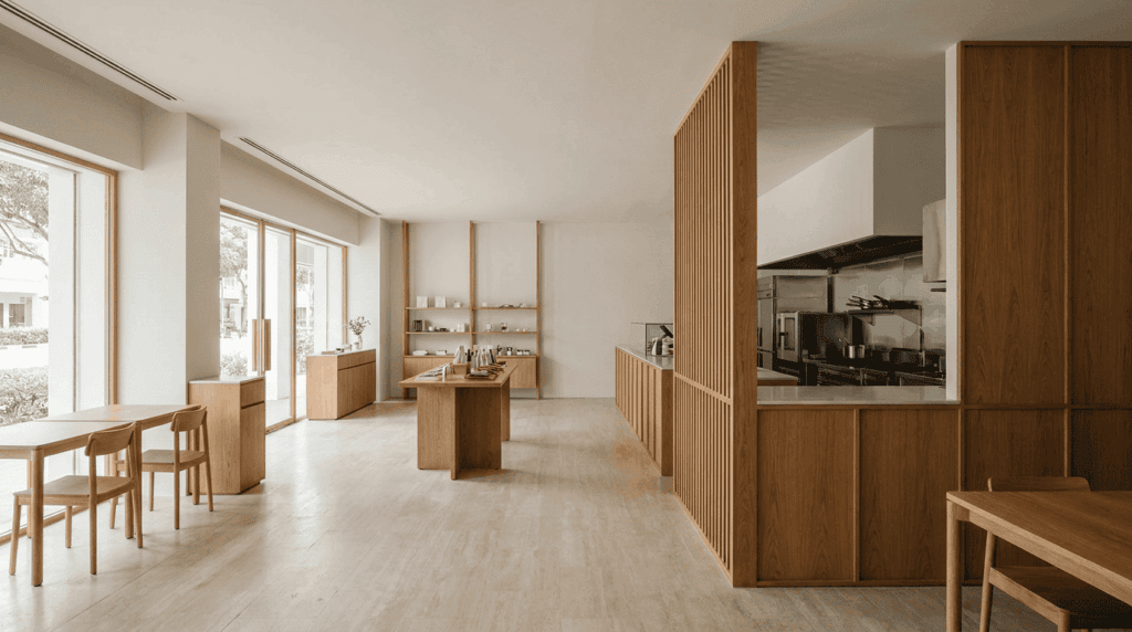
Staff and customers have different needs inside the same space. Staff need to move between stations without crossing the customer floor, reach storage quickly, and keep an eye on what is going on around them. Customers need a clear entry, enough space to look around without feeling like they are in the way, and a sense of where things are.
Zoning is how you assign a clear purpose to each part of the floor plan before anything else gets decided.
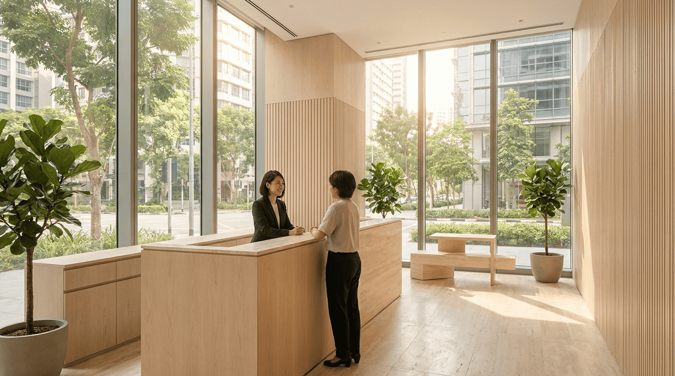
Front-of-house covers the areas customers use: the entry, browsing floor, waiting areas, consultation spots. One thing that gets overlooked near the entrance is leaving a short stretch of open space before the first display or fixture. It gives customers a second to get their bearings before anything is competing for their attention. Skipping this and placing product right at the door tends to create the opposite effect.
Back-of-house needs to be close enough to the service floor that staff is not walking far to get basic things done. When it is tucked away at the far end of the building, every task takes a bit longer. A study on retail layout and perceived crowding found that how a floor plan distributes service points, storage, and circulation paths shapes both how efficiently staff can work and how crowded the space feels to customers, even when the number of people in it stays the same.
The area between front-of-house and back-of-house is where these two worlds meet. Staff crosses customer paths here, stock gets moved during trading hours, and the working side of the business can accidentally become visible to visitors. A partial partition, a flooring change, or a more deliberate circulation route can handle most of this.
Customer Flow Design: How Visitors Actually Move

Customer flow design is about mapping out the paths visitors take from the moment they walk in to the moment they leave. Where they enter, where they slow down, and what they see at each point.
It is not really about clearing enough space for people to walk. Research comparing free-flow and grid-style store layouts shows that the type of layout directly affects how crowded a space feels and how much of it customers actually end up using. A corridor that is a little too narrow reads as packed even when it is not. A product display positioned where people naturally stop creates engagement without anyone having to be nudged toward it.
Entry anchoring is the practice of placing something visually clear or useful right at the point where a visitor arrives. It cuts down on confusion and reduces the need for signage later. Dwell points are areas where customers naturally pause. They work best when planned rather than shaped by where furniture happened to land.
“Flow is a design output, not an accident. When it is planned, it supports both the customer experience and the staff’s ability to serve.”
Staff Ergonomics and Workspace Efficiency
The way a space is physically set up for staff has a real effect on how well they can do their job. Counter height, how far they can see across the floor, and how much ground they cover between tasks all add up across a full day.
Counters at the wrong height cause posture strain that builds over time. The WELL Building Standard, a globally recognised framework for how physical environments affect human health, covers comfort and spatial conditions across both office and customer-facing commercial settings. Counter depth, equipment placement, and how easily staff can make eye contact with the person they are serving are all worth sorting in the planning stage, not after fit-out.
Visibility matters too. A staff member who cannot see the floor from their position cannot respond quickly when someone needs help. The route between a workstation and the stock room should also be short. A thirty-second walk to retrieve something happens dozens of times a day and slows everything down for the people waiting.
Lighting and Acoustics
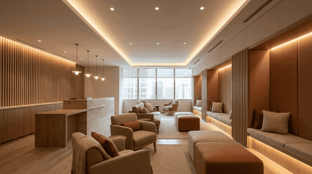
Lighting tends to get sorted after the layout is already locked in. It should be part of the planning. Customer areas work best with three types of light: ambient for the overall space, task over key surfaces, and accent to highlight certain zones. Remove any one and the space becomes harder to read visually.
Staff areas need something different: consistent, even light that makes it easy to work accurately without eye strain.
Acoustics get even less attention, but they affect both groups. Spaces with a lot of hard surfaces, like concrete, glass, and bare ceilings, bounce sound around, and it gets noticeably louder as more people arrive. For customers, that makes conversation harder and shortens how long they want to stay. For staff, it affects focus and makes interactions more tiring. A good portion of this can be handled through materials that double as aesthetic choices: fabric seating, carpet where it makes sense, timber panels, soft furnishings. The acoustic benefit does not require a separate solution, but the choice does need to be made with it in mind.
What a Brief Should Cover
A commercial space design brief covering both staff and customers should include:
- Staff count at peak and how they move through the space
- The customer journey from entry to exit, with dwell points and service touchpoints marked
- Back-of-house storage and prep needs relative to the customer floor
- Lighting requirements by zone, with staff and customer areas treated separately
- Acoustic considerations for the business type
- How the handover area between front and back will work during trading hours
This brief is what commercial interior design decisions are built on. For a wider look at how layout choices connect to business outcomes, Singapore’s evolving commercial design landscape covers the forces shaping how spaces are being planned right now. For spaces where efficiency and experience need to coexist, the wabi-sabi approach to commercial interiors is worth a look. Simplicity and visual calm tend to serve both staff and customers better than a complicated layout.
Frequently Asked Questions
1. What is commercial space design and how does it differ from interior design?
Commercial space design is the functional planning of a business interior: the layout, how people move through it, and how staff and customer areas relate to each other. Interior design is about how that space looks and feels through materials, finishes, and aesthetics. The spatial planning comes first. Interior design follows from it.
2. How does visitor movement through a space affect business performance?
The way customers move through a space shapes how long they stay and how many service interactions actually happen. A confusing entry, narrow walkways, or counters that are hard to find all reduce the time people spend and limit what the business can do during each visit.
3. What should a project brief include?
At minimum: staff counts at peak, the full customer journey, back-of-house requirements, lighting needs by zone, and acoustic considerations. It should also cover how staff and customer zones connect during trading hours.
4. Why do commercial fit-outs often underserve staff even when the customer experience looks good?
Staff needs are often treated as operational issues rather than design decisions. Counter height, storage location, sightlines, and movement routes tend to get resolved by contractors late in the build, after the customer-facing layout is already set. Getting those into the brief early produces a better result for both sides.
5. Can a small commercial space work well for both staff and customers?
Yes, but it takes more considered planning, not less. Smaller spaces benefit most from a clear zone layout and a well-thought-out handover between staff and customer zones. There is less room to compensate for a layout that was not planned with both groups in mind.