How to Incorporate Colour Psychology Into Your Corporate Interior Design?
In Singapore’s fast-paced corporate world, workplace environments are no longer designed purely for function. Today, companies are recognising the power of design elements—especially colour—in influencing emotions, behaviour, and productivity. This is where colour psychology plays a transformative role. By understanding how colours affect human psychology, businesses can craft workplaces that inspire collaboration, reduce stress, and reflect their brand identity.
For organisations working with experts in commercial interior design in Singapore, colour psychology has become a vital tool to create spaces that balance aesthetics with performance. Let’s explore how you can incorporate it into your corporate interior design strategy.

Why Colour Psychology Matters in the Workplace
Colour psychology is the study of how different hues influence moods and behaviours. It’s widely used in marketing and branding, but its application in workplace design is gaining traction across Singapore. When used effectively, colours can:
- Enhance productivity: Certain colours stimulate focus and alertness.
- Promote well-being: Calming shades reduce stress and anxiety.
- Communicate brand identity: Corporate colours strengthen company culture.
- Influence client perceptions: First impressions often come from visual impact.
In a city where competition is intense, offices that feel inspiring and aligned with brand values provide businesses with an edge.
Understanding Colour Associations
Before integrating colours into your workspace, it’s important to understand the common psychological associations attached to them:
- Blue: Stability, trust, and focus. Commonly used in corporate settings.
- Green: Balance, renewal, and calmness. Ideal for reducing stress in high-pressure environments.
- Yellow: Optimism, creativity, and energy. Perfect for brainstorming areas.
- Red: Passion, urgency, and excitement. Best used sparingly to avoid overstimulation.
- Grey: Professionalism, neutrality, and sophistication. Works well for sleek, modern offices.
- White: Cleanliness, simplicity, and openness. Popular in minimalist design.
While these associations are universal, cultural context matters too. In Singapore, where multicultural influences shape perceptions, subtle adjustments in tone and placement ensure that colour choices resonate widely.

Applying Colour Psychology to Corporate Interiors
1. Reception and Client-Facing Spaces
Your reception area sets the tone for everyone entering the office. Warm tones like soft yellows or muted oranges can make clients feel welcome, while blues and greys communicate professionalism. Adding a feature wall in your brand colour strengthens recognition and trust.
2. Workstations and Open Offices
For areas where concentration is key, shades of blue or green are ideal. They promote calm focus without overwhelming employees. To avoid monotony, you can incorporate accents of brighter colours—such as yellow desk accessories or red breakout seating—to inject energy.
3. Meeting Rooms
The choice of colour in meeting rooms can impact collaboration. Light blues and greens encourage calm discussions, while touches of yellow stimulate creativity. For high-stakes boardrooms, darker hues like navy or charcoal project authority and seriousness.
4. Breakout Zones and Cafeterias
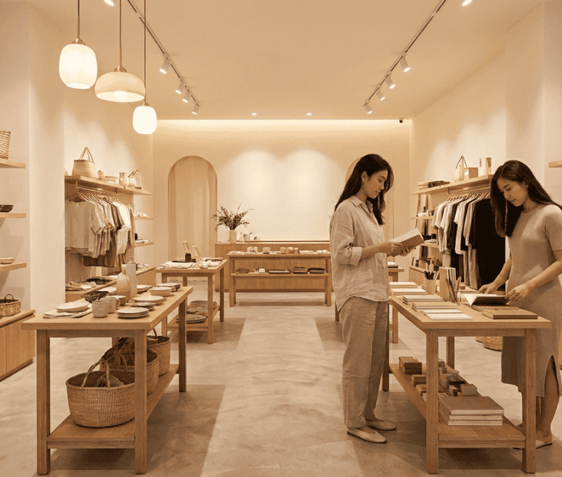
These areas should feel relaxing and inviting. Natural tones, greens, and warm, earthy shades create a sense of comfort and allow employees to recharge. Some companies in Singapore also opt for vibrant murals or accent walls to energise staff during breaks.
5. Executive Offices
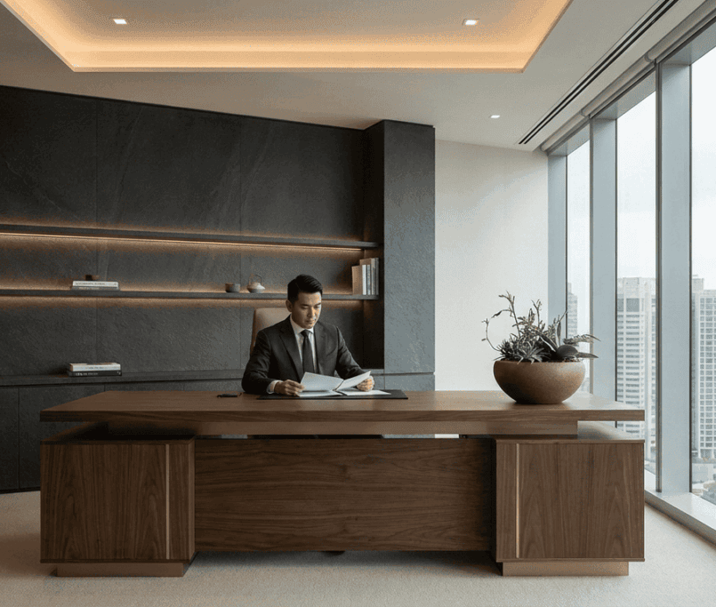
For leadership spaces, darker shades like deep blue or mahogany project authority, while lighter neutrals maintain a sense of openness. Integrating subtle touches of brand colours reinforces alignment with corporate identity.
Read More: 5 Dos and Don’ts for Corporate Interior Design in Singapore

Balancing Colour with Lighting and Materials
Colour psychology does not exist in isolation. The effect of colours changes depending on lighting, texture, and surrounding materials. For example:
- Natural light enhances warm and cool tones differently throughout the day.
- Wooden finishes paired with green hues evoke nature and tranquillity.
- Glass and metal surfaces with blues or greys amplify modern sophistication.
A well-planned interior considers these elements holistically, ensuring that colours feel consistent and intentional across the office environment.
Trends in Colour Psychology for Singapore Workplaces
The corporate landscape in Singapore is evolving, with growing emphasis on employee well-being and sustainability. Current trends in colour use reflect this shift:
- Biophilic Design: Greens combined with natural textures mimic outdoor environments, promoting mental health.
- Minimalist Palettes: Whites, greys, and subtle accents remain popular for tech-driven companies seeking sleek aesthetics.
- Cultural Nuance: Red is used strategically, given its significance in Asian cultures, symbolising prosperity and luck.
- Hybrid Work Considerations: Bright, uplifting colours are added to attract employees back to the office and make the workplace more engaging.
When applied thoughtfully, these trends ensure offices are not just functional but also meaningful, reflecting Singapore’s unique blend of modernity and tradition.

How Businesses Can Get Started
To incorporate colour psychology effectively, businesses should:
- Define Objectives: Identify whether the priority is productivity, relaxation, creativity, or brand alignment.
- Work with Professionals: Partnering with specialists in commercial interior design Singapore ensures choices are data-driven and tailored to your brand.
- Test and Adapt: Use pilot projects or sample areas to evaluate how employees respond before scaling changes.
FAQs
Q1. How do I choose the right colours for my office in Singapore?
Start by aligning colour choices with your company’s goals. For example, if you want to enhance focus, opt for blues and greens. If creativity is the objective, add yellow accents. Consulting a professional designer ensures colours complement your brand identity and office layout.
Q2. Are there cultural factors I should consider when selecting colours?
Yes. In Singapore’s multicultural environment, colours carry different meanings. For instance, red symbolises prosperity in Chinese culture but can feel overwhelming if overused. A balanced, respectful approach ensures inclusivity while still achieving psychological impact.
Q3. Can colour alone improve employee productivity?
Colour plays a significant role, but it should be combined with other design elements such as lighting, ergonomics, and space planning. Together, these create a holistic environment that supports well-being and performance.
Read Next: How Office Interior Design can Improve Employee Productivity and Morale
Final Thoughts
Colour psychology is more than an aesthetic choice—it is a strategic tool that can transform how employees feel and perform at work. For businesses in Singapore, thoughtful use of colour in corporate interiors reflects not only brand values but also a commitment to employee well-being.
Partnering with a trusted expert in commercial interior design in Singapore, like Cactus Art, ensures that your workplace design goes beyond style to deliver measurable results. With the right blend of colours, materials, and cultural sensitivity, your office can become a space where people feel motivated, inspired, and proud to belong.